How to Read Stock Charts - Comprehensive guide

How to read stock market charts is often an important question faced by stock market investors, especially beginners. Stock investing requires a fundamental analysis of the company and a technical analysis of the stock price.
So, if you want to invest in the stock of a particular company, analyzing its financials, management team, competitive landscape, etc., can help you understand if the company can withstand economic volatility.
Also, technical analysis, which primarily includes reading stock charts, can help you look at how the stock price has reacted to market changes over time and identify trends that might help you make informed decisions.
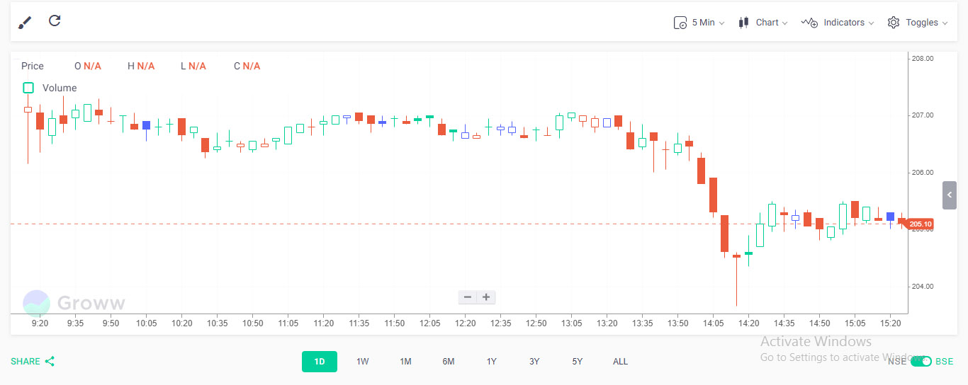
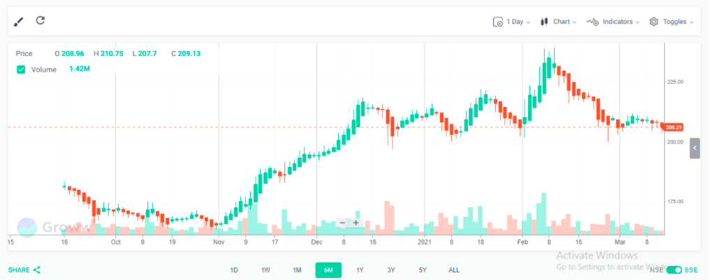
At Groww, we understand that stock investing requires a careful analysis of the stock price and offer some advanced chart options to help you in reading charts in the stock market. When you search for a stock on Groww, you are offered a basic stock chart as shown below:
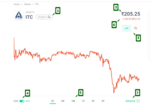
As you can see, the basic chart offers a visual view of the performance of the stock price over a selected period, along with the following information and options:
- Total number of shareholders in the company
- The current stock price
- The choice of two chart types – Line chart and Candlestick chart
- The choice between the performance of the share on two stock exchanges – NSE and BSE
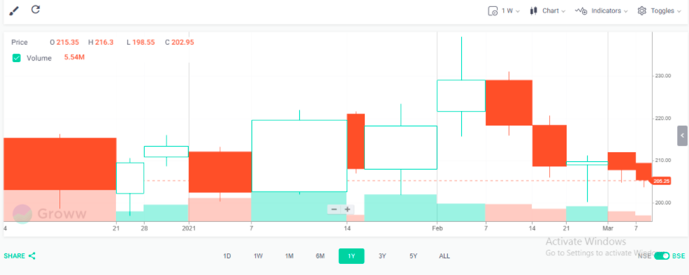
- The period for which you want to see the performance of the stock price –
- One day (1D)
- One week (1W)
- One month (1M)
- One year (1y)
- Three years (3Y)
- Five years (5Y).
- Based on the period selected, the percentage loss/gain
- Advanced chart options
This basic view offers a quick glance at the price movement based on the demand and supply of the stock. For a more detailed analysis, you can click on the ‘Advanced’ option.
Advanced Stock Chart Options
When clicking on the ‘Advanced’ option, the following screen is displayed:
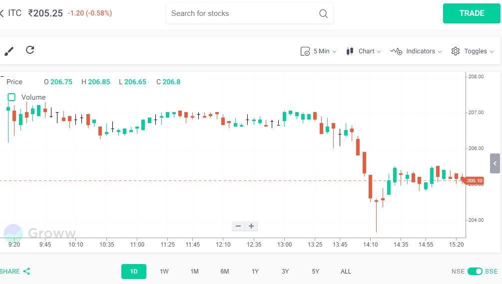
Here are the options and information available through this screen:
1. Stock Price
Right at the top of the screen, you can see the name of the stock and the current stock price. If you are looking at the chart after market hours, then it would display the stock price at the close of the previous trading day.
![]()
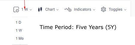
2. Time Period
At the bottom of the screen, you can select the period for which you want to check the performance of the stock. There are preset values here:
- One day (1D)
- One week (1W)
- One month (1M)
- Six Months (6M)
- One year (1y)
- Three years (3Y)
- Five years (5Y)
- All

Each of these periods can be used based on the kind of research you are conducting with respect to the stock. For example, an intraday trader can select 1D or 1W to assess the stock’s recent performance and make trading decisions. However, long-term investors would want to look at 3-5 years to assess the performance of the stock across different market cycles.
3. Time Interval
Once you have selected the time period, you also need to select the interval at which you need the chart plotted. For example, if you select the time period as one day, then you need to determine if you want the data points to be plotted every minute, five minutes, ten minutes, 15 minutes, 30 minutes, one hour, or four hours.
Here is a table of time intervals available per time period:
| Time Period | Time Intervals | Screenshots |
| One Day |
|
 |
| One Week |
|
 |
| One Month |
|
 |
| Six Months |
|
|
| One Year |
|
|
| Three Years |
|
 |
| Five Years |
|
 |
| All |
|
You can choose the time intervals based on how you want to analyze the stock’s performance.
4. Price
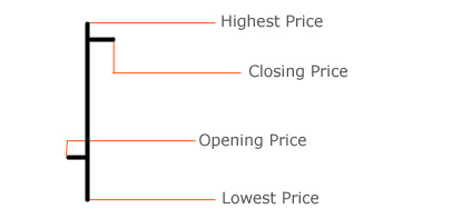
Let’s say that you choose a time period of one day and a time interval of five minutes. The stock chart will be plotted using price details for every interval. Hence, you will have four price points for each interval like opening price, closing price, highest price, and lowest price of the stock.
This can be beneficial for traders as it can offer insights into the volatility of the stock price over a given period at every interval.
For example, you can look at the stock chart for the previous day with an interval of five minutes to gauge the volatility in price throughout the day. You can analyze for several days in succession and observe trends to make smart trading decisions.

If the prices are written in green, then it denotes that for the given interval, the price of the stock at the end of the interval was higher than that at the start.
For example, let’s say that you choose an interval of five minutes and are looking at the time 11.30 to 11.35. If the stock price at 11.30 was Rs.100 and at 11.35 was Rs.105, then all the prices would be written in Green. However, if the price at 11.35 was Rs.95, then all the prices would be written in Red. Hence, you can quickly assess the performance of the stock within each interval by looking at the colour changes.
5. Volume
Right below the price section, you have a clickable option to assess the volume of transactions of the said stock. As soon as you click it, a bar chart appears at the bottom of the chart area displaying the trading volume for the selected period. The height of the bar represents the volume. So, a taller bar means more volume and vice-versa.
Here is a quick look at the volume section:

You can also see that the bars are coloured – green and red. A green volume bar means that the stock closed higher in that interval compared to the previous interval’s close. A red volume bar means that the stock closed lower during the current interval compared to the previous interval’s close.
So, a tall green volume bar means an interval where the stock closed higher than the previous interval with high trading volumes – a sign of optimistic investor sentiment towards the said stock.
It is important to remember that sometimes, there can be a difference in the colour of the volume bar and price bar/point/line. This can happen when the stock price is higher than the previous interval but has moved lower than the opening price.
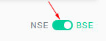
6. Stock Exchange
On the bottom right corner of the screen, there is a button to switch between the National Stock Exchange (NSE) and the Bombay Stock Exchange (BSE). You can view the price movements on the exchange that you invest in.
On the top menu, you have an option to select the chart style from the range of options listed. You need to choose the chart type based on the information you are seeking. Here is a list of options available.
7. Chart Style
a. Candle
Candle or candlesticks are a great visual representation of the fluctuations in the price of a stock. Traders use this to identify trends and estimate the direction the stock price can take in the near term. These are highly popular among traders and investors as they pack a lot of information in them.
Each candle has three parts – the body, lower shadow, and upper shadow. Also, each candlestick offers a visual representation of the opening price, closing price, highest price, and lowest price of the interval it represents. Here is an example:

As you can see, a single candlestick displays information about different aspects of the stock price. When viewed over a period, this can be a wealth of information for traders/investors. Here is how you can read a candlestick chart:
- The body represents the opening and closing prices of the stock. If it is red, then the stock closed lower than its opening price.
On the other hand, if it is green, then the closing price was higher than the opening price. If you are looking at a week/month/year, a larger number of consecutive reds imply that the stock price is falling and consecutive greens imply a steady rise in the price. - The shadows above and below the body represent highs and lows during the interval. A short upper shadow on a red candle means that the stock opened near the high of the interval but closed lower.
On the other hand, a short upper shadow on a green candle means that the stock closed near the high of the interval.
There are various patterns in a candlestick chart that can help you identify trends with ease.
|
▶️ You may also want to read: How to Read Candlestick Charts |
b. Hollow Candle
While in standard candlestick charts, all candles are coloured, the hollow candlestick chart uses fill attributes and different colours to display the behaviour of stock price. This is what a hollow candlestick chart looks like:
As you can see, there are different types of candles in this chart:
| Type of Candle | Description | Image |
| SOLID | Closing price is lower than the Opening price |  |
| HOLLOW | Closing price is higher than the Opening price |  |
Color of the candle:
| Color of Candle | Description | Image |
| GREEN | The Current candle’s closing price is higher than the previous candle’s closing price |  |
| RED | The Current candle’s closing price is lower than the previous candle’s closing price |  |
| BLUE | The current candle’s closing price is the same as the previous candle’s closing price |  |
Hence, you will have different types of candles in a hollow candlestick chart:
 |
SOLID RED Candle
Typically, indicates a price decline. |
 |
HOLLOW RED Candle
Typically, indicates a trend of price decline with but an increase in price in the current interval. |
 |
SOLID GREEN Candle
Typically, indicates a trend of price increase but a decline in price in the current interval. |
 |
HOLLOW GREEN Candle
Typically, indicates a trend of price increase. |
 |
SOLID BLUE Candle
You need to look at more intervals to identify a trend. This represents a steady price movement over two intervals. |
 |
HOLLOW BLUE Candle
You need to look at more intervals to identify a trend. This represents a steady price movement over two intervals. |
It is important to remember that the solid candles in a traditional candlestick chart where all candles are solid behave differently than solid candles in a hollow candlestick chart. Here are some tips to help you read a hollow candlestick chart:
It is important to remember that the solid candles in a traditional candlestick chart where all candles are solid behave differently than solid candles in a hollow candlestick chart. Here are some tips to help you read a hollow candlestick chart:
- Look at the fill attribute of the candle (disregarding the colour)
As explained above, if the candle is hollow, then the stock closed higher than its opening price and vice-versa if it is filled with any colour. Hence, when you glance at a hollow candle chart, if you can see more hollow candles, then it means that the stock price has experienced intraday price increases more frequently. This can be a great tool for day traders.
- Look at the colour of the candle
More greens in a hollow candlestick chart indicate a trend of the price increase. On the other hand, if there are more red candles (hollow or not), it means that the stock price is declining. This can be a great tool for medium-to-long-term investors.
- Combine the fill attributes and colour of the candles
Here is a sample hollow candlestick chart for a period of six months with an interval of one day:

As you can see above, there are periods when the stock price has rallied and corrected. Based on the colours, you can see that while the months of November and December displayed a price increase trend, there were spurts of correction from January.
Further, if you look at the fill attributes, you can observe that the period where the colours are green and the candles are hollow is the time where the stock price rallied and filled candles that were red in colour were periods where major correction occurred. Similarly, you can analyze any stock based on the period and interval you want.
C. Volume Candle
By now, you should be fairly conversant with candlesticks. The height of a candlestick represents the difference between the opening and closing prices for the interval, the wick/shadow length representing the highest and lowest prices respectively.
In volume candlestick charts, one more dimension is added – the width of the candle representing the trading volume. If the candle’s body is skinny, then it represents a low-trading volume in the interval, and if it is wide, then the volume is higher. Also, a red candle with a wide body indicates a price drop where many people are selling the stock and vice-versa with green candles.
Therefore, a volume candlestick chart is a step up from a standard candlestick chart since it allows you to assess the trading volume along with the price movement to assess the market sentiment and estimate the trend.
Here is an example:
The large red candle at the beginning of the period represents periods where the trading volumes were high and the stock price was declining (2020). While there was some green-relief in Nov-Dec, 2020, major recovery took place between January and March 2021. This chart can give you a better idea about the price and volume of a stock at a glance.
D. Bar
A bar stock chart is similar to a candlestick chart with the difference being that the candles have a body, while bar charts have straight lines. They offer similar information like the opening price, closing price, highest price, and lowest price.
A bar chart has a vertical bar denoting the range in which the price fluctuates during the interval. There is a horizontal bar on each side (feet of the bar) that denotes the opening and closing price of the stock in the interval. The foot on the left side is the opening price, and the one on the right side is the closing price.
Here is what a bar looks like:
Reading a bar chart is similar to a candlestick chart too. The only difference is the presence of the feet instead of the body. Here are some tips:
- If the opening foot is below the closing foot, then the stock price has moved up during the interval.
- If the opening foot is above the closing foot, then the stock price has fallen during the interval.
You can also calculate the range of the bar by subtracting the low from the high. The taller the bar, the more the price fluctuated in the interval. Here is what a bar chart looks like:

E. Colored Bars
While a basic bar chart has bars of the same colour, many platforms offering stock charts include an option of a coloured bar chart too. The bars are coloured green or red based on the following aspects:
- If the closing price of the current interval > the closing price of the previous interval, then the bar is green.
- If the closing price of the current interval < the closing price of the previous interval, then the bar is red.
- If the closing price of the current interval = the closing price of the previous interval, then the bar is coloured the same as the previous interval.
| Colour of Candle | Description | Image |
| GREEN | The current bar’s closing price is higher than the previous bar’s closing price. | 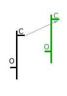 |
| RED | The current bar’s closing price is lower than the previous bar’s closing price. |  |
| Same as Previous Bar | If the current candle’s closing price is the same as the previous candle’s closing price, then the current bar is colored the same as the previous bar. |  |
There are various tricks that can help you interpret bar charts:
- You can identify an up-trend by spotting a series of bars with higher highs and higher lows. Similarly, a down-trend can be identified by a series of bars with lower highs and lower lows. Here is an example:

- Sometimes, a bar might have a higher high and a lower low than the bar in the previous interval, OR a lower high and a higher low, OR an equal high/low as shown below:

These are unclear trends and cause uncertainty in the minds of investors/traders.
- If the length of the bar is increasing in an up-trend, then it is usually a sign of increasing eagerness from buyers. In a down-trend, this can be a sign of increasing eagerness of sellers. Similarly, if the length of the bar is decreasing, then it can be a sign of decreasing eagerness as shown below:


- There is another way to assess the eagerness of buyers and sellers using a bar chart. You can compare the closing foot on two consecutive bars and check if the current foot is higher or lower than the previous one and to what extent. The larger the increase/decrease, the greater the eagerness. Here is a quick view:


There are many other ways in which you can analyze a bar chart. Ensure that you understand it completely before making investing decisions.
F. Range Bars
Range bar charts are unique since they are based on price only, and not time or any other aspect. These are not as popular as the regular time-based charts where a fixed number of bars are plotted for a fixed interval, regardless of the volatility or price movements. Range bars are designed to help traders view volatility differently and utilize it to their benefit.
In a time-based chart, if you select the time interval as one hour, then the chart will show price activity per hour for the selected period. Even if the market goes through a lot of volatility or has high trading volumes, the number of bars plotted remains the same.
However, in range bar charts, more bars are printed if the volatility is high and less if it is low. Some primary rules of range bars are:
- Each range bar has a high-low range.
- Each range bar opens outside the high-low range of the previous bar.
- Each range bar closes at either its high or its low.
Here is a sample range bar chart for your reference:

As you can see, a new bar is plotted only when the preset range is fulfilled. This can help you get a clear view of how the stock’s price is moving. Further, you can identify support and resistance levels using horizontal trend lines and trending periods using up and down-trend lines. Using a range bar chart successfully requires you to spend some time observing the way it works and do some paper trading before using it for your investments.
G. Line Chart
A line chart is the most basic type of stock chart that tracks the closing price of a stock over time. Based on the period and interval chosen by you, the closing price is represented by a dot and all dots are joined together using a line.
Since it only tracks the closing price, there is no information about the day’s highs and lows and/or intraday price movements. Here is what a line chart looks like:

These charts are used by beginners to gauge if the stock is increasing or decreasing in price. It also offers a quick view of the volatility in stock price.
H. Colored Line Chart
Coloured line charts offer a slightly better view of the price fluctuations by colouring the line segment red if the current interval’s closing price is lower than the previous interval and green if it is higher. This allows you to quickly assess the performance of the stock over the time period across intervals.
Here is what it looks like:

I. Heikin Ashi
Heikin Ashi is a Japanese technique used on a candlestick chart with a modified formula based on two-period averages. This creates a smoother chart, filters out unnecessary noise, and helps investors/traders identify trends and reversals with ease.
In simple terms, the Heikin Ashi chart uses average price data for plotting. Hence, it is considered to be a better indicator of trends than the standard candlestick charts.
Here is how it looks:

A standard candlestick chart uses the opening, closing, highest, and lowest prices which can lead to some gaps and a lot of noise in the chart.
By working on averages, the Heikin Ashi chart offers a better picture of trends and reversals. This is because it averages the price data over two intervals. Hence, while a standard candlestick chart change frequently from up to down based on market volatility; in a Heikin Ashi chart, you have more consecutive coloured candles making it easier to spot trends.
The first chart above shows the Heikin Ashi technique used on the candlestick chart shown below. As you can observe, the Heikin Ashi chart is smoother than the candlestick chart and has more consecutive colours too. It is important to remember that the Heikin Ashi does not display the actual market price since it works on averages. Also, Heikin Ashi charts tend to stay red for longer during a down-trend and green during an up-trend.
Here are some tips to help identify opportunities using a Heikin Ashi chart:
- Green candles with no lower wicks/shadows indicate a strong up-trend.
- Consecutive green candles indicate an up-trend and red candles indicate a down-trend.
- A trend change is usually indicated by candles with a small body and both upper and lower wicks.
- Red candles with no upper wicks indicate a strong down-trend.
J. Renko
A Renko chart is another contribution from the Japanese to stock charts. In the Japanese language, ‘Renko’ means bricks and has been named so since the chart looks like a chain of bricks.
These bricks are placed at a 45-degree angle to each other when the stock price increases/decreases by a certain amount. If the price increases, the brick is coloured green and red if it falls.
Here is how it looks:

While these charts have a time axis, a brick is not formed based on time but only when it crosses the preset threshold. Hence, in Renko charts the movements are minimal and they offer a broad-level perspective to stock volatility. These charts are created using the closing price based on the interval chosen.
The simple construction of Renko charts makes it easier for investors/traders to spot trends. However, some price information is lost in this process. They are also known to be effective in spotting support and resistance levels.
In the image above, the stock price shows a strong up-trend with a couple of dips and a subsequent dip during the end of the selected period. The two red dots in the centre can be seen as excellent buying opportunities after a short pullback.
K. Mountain
A Mountain chart is primarily a Line chart with the space below the line filled with colour giving the chart the appearance of a mountain range. It is also known as an Area chart. It offers all information like a standard line chart. Hence, apart from looking more colourful, mountain and line charts are the same. Here is what they look like:

L. Baseline Chart
A Baseline chart plots a line/mountain chart around a baseline determined by you. The area above the baseline is coloured green and below it is coloured red. On the Groww platform, you can adjust the baseline by using a slider to the right of the screen, right next to the Y-axis as shown below:
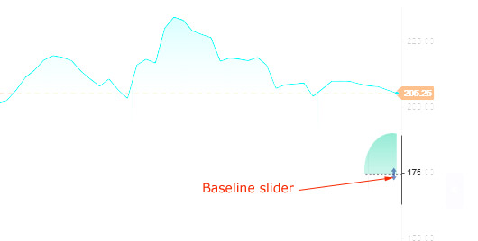
Here is what a Baseline chart looks like:

Many traders set the baseline at the opening price of the stock to assess its movement and make buy/sell decisions accordingly.
M. Line Break Chart
Another contribution by the Japanese to stock charts, a Line Break chart is another way to reduce market noise and spot trends and reversals. Many new traders can mistake a line break chart for a candlestick chart since they look similar. However, they are created differently and offer different sets of information. Here is how a line break chart looks:

In a line break chart, each of the candle-like blocks as can be seen above are called lines. If you look carefully, each consecutive red line has a closing price lower than the previous line. Also, each consecutive green line has a closing price higher than the previous line.
To plot a line break chart, the following rules are used:
- If the interval line closes at a price lower than the lowest price of the last three lines, then a new red line is drawn with its opening value being equal to the low of the previous line and closing value equal to the current line’s closing value.
- If the interval line closes at a price higher than the high of the preceding line, then a new green line is drawn with its opening value being equal to the high of the previous line and closing value is equal to the current line’s closing value.
- If neither of the above is true, then no new line is drawn.
Many traders use this chart to create trading strategies. We urge you to spend some time and do paper trading before making investment decisions based on this chart.
N. Point and Figure Chart
This chart is also independent of time. Points are plotted based on price movements. In a Point & Figure chart, there are two columns, one with X’s and the other with O’s. These represent filtered price movements. The X-columns represent rising prices and the O-columns represent falling prices. These charts offer some unique advantages:
- Price movements that are not significant are filtered out and important movements are highlighted
- Time aspect is not excluded in the analysis process
- You can spot support and/or resistance levels with ease
Here is how a Point & Figure chart looks:

It is important to spend some time understanding these charts before using them to make investment decisions.
It is important to spend some time understanding these charts before using them to make investment decisions.
8. Indicators
On the top menu, you also have an option to select indicators that you can overlay on the chart for customized analysis.
1. RSI – Relative Strength Index
One of the fundamental aspects that traders look for is assessing the momentum of the stock price. The Relative Strength Index or RSI is one of the most commonly used momentum indicators. It measures the extent of the recent fluctuations in price and assesses if the stock has been oversold or over-purchased.
You can choose the RSI indicator via the Indicator tab at the top of the screen. As soon as you click it, a line graph is displayed on the screen, below the existing chart (as selected by you). This is an oscillator graph that reads between 0 and 100.
Typically, an RSI reading of less than 30 indicates a stock that is oversold or undervalued; and reading of greater than 70 indicates a stock that is overvalued or over-purchased. Here is what an RSI oscillator looks like:

This indicator offers valuable insights into the volume/price condition of the stock.
2. MACD – Moving Average Convergence Divergence
For traders who understand statistics, MACD is a common function used to assess if the bullish or bearish trends in the price of a stock are getting weaker or stronger.
MACD is a momentum indicator that plots the relationship between two moving averages (MAs) of the price of a security. To calculate MACD, the 26-period exponential moving average or EMA is subtracted from the 12-period EMA.
Further, a nine-day exponential moving average of the MACD called the Signal line, which offers triggers for buy and sells transactions, is also displayed on the chart.
On Groww, MACD is displayed along with a histogram that highlights the distance between the MACD line and the Signal line. MACD, along with the RSI indicator can offer a clearer perspective about the price momentum of a stock. Here is how a MACD graph looks:

Lastly, you can right-click on the MACD area and customize the settings to choose values as needed by you for your analysis.
3. VWAP – Volume Weighted Average Price
The Volume Weighted Average Price or VWAP is an excellent indicator of the relative strength of a stock. It is the average trading price of a stock in a day based on the stock price and trading volume. It is used primarily by short-term stock traders to get a more accurate estimate of the price action. There are various ways in which this indicator can be used to make profitable trading decisions quickly including:
- VWAP Pullback Entry
- VWAP Breakout Entry
- Aggressive trade Stop
- Pullback Stop
- Selling at the day’s high
- Selling at a Fibonacci Extension Level
It is preferred by traders since it allows them to:
- Buy low and sell high
- Receive a signal of change in the market bias
- Get dynamic support and resistance levels
- Be sure about counter-trend trading opportunities
- Beat the high-frequency trading algorithms
As a trader, using a VWAP indicator will require a lot of practice of reading it and correlating it with trading opportunities. Here is what it looks like:

You also have the option of plotting the standard deviation bands above and below the VWAP line. There are three options available as shown below:

Observing how the stock price performs within these standard deviation bands can offer interesting buying and selling areas to traders.
4. Moving Average
As a trader, one of the most difficult things to do is predict trends in the stock markets. To avoid complete speculation, chart analysis and using the right indicators is crucial.
A moving average indicator is widely used by traders to identify an up-trend, down-trend, upward momentum, and downward momentum. It is also used to identify support and resistance levels. This is what a moving average looks like on a candlestick chart:

On the Groww platform, if you right-click on the moving average line, you can choose the period for which you want to view the moving average. Usually, traders opt for a 50 or 200-day moving average. It is important to remember that since this is a moving average, a shorter period would make it highly sensitive to price movements, and a longer period would make it less sensitive.
Depending on your needs, you can choose the period and view the moving average for the stock.
Here is some information provided by a Moving Average (MA) indicator:
- Up-trend – when the MA line is rising
- Down-trend – when the MA line is dipping
- Upward momentum – when the short-term MA line crosses over the long-term MA line
- Downward momentum – when the short-term MA line crosses below the long-term MA line
When you right-click on the MA line, you can choose from the following options:
- Period – a free-flowing text box where you can enter the number of days you want to view the moving average of.
- Field – the price for which you want to calculate the moving average. This includes:
- Open or opening price
- High or the highest price in a trading day
- Low or the lowest price in a trading day
- Close or closing price
- Adj_Close or the adjusted closing price calculated after accounting for any corporate actions
- HL/2 or (Highest Price + Lowest Price)/2 – offers a moving average of the average price between the highest and lowest price every day.
- HLC/3 or (Highest Price + Lowest Price + Closing Price)/3 – offers a moving average of the average price between the highest, lowest, and closing price every day.
- HLCC/4 or (Highest Price + Lowest Price + 2*Closing Price)/4 – this is also known as the weighted close moving average and offers a moving average of the average price between the highest, lowest, and 2 times the closing price every day.
- OHLC/4 or (Opening Price + Highest Price + Lowest Price + Closing Price)/4 – offers a moving average of the average price between the opening, highest, lowest, and closing price every day.
- Type or the moving average type that you want to use to plot the line. There are various types of moving averages including:
- Simple – a simple average of all prices
- Exponential – gives more weight to recent price points
- Time Series – plotted using linear regression techniques
- Triangular – averaged twice
- Variable – sensitive to the increasing volatility in the market
- VIDYA – or Volatility Index Dynamic Average adjust the speed of averaging based on the volatility in the market
- Weighted – offers more weight to recent price points and less to the older ones
- Welles Wilder – smoothes price movements to help identify bullish/bearish trends
- Hull – manages to offer a smooth line with minimal lag
- Double Exponential – uses two exponential moving averages to eliminate lag
- Triple Exponential – uses three exponential moving averages to eliminate lag
- Offset – this can be a positive or negative value based on whether you want to forecast trends better or fit the price movements of the stock.
5. Bollinger Bands
Bollinger Bands define a price range plotted at one (or more) standard deviation levels above and below the simple moving average of the price of the stock. Hence, they are excellent indicators of high or low prices on a relative basis. This is what a Bollinger band plot looks like:

Here are some tips to help you understand Bollinger bands and use them to make trading decisions:
- If the market volatility is low, the bands tighten. Hence, it increases the possibility of the price moving sharply in either direction.
- On the other hand, when market volatility increases, the bands separate by a large amount. This can be seen as an indicator of the end of the current trend.
- Most traders spend time understanding the Bollinger band indicator and estimating entry/exit points to book profits. For example, some traders believe that if the stock price starts rising from the lower band and crosses the moving average line, then it usually hits the upper band. Hence, they invest accordingly.
- There are times when price trends continue for an extended period. While Bollinger bands cannot help identify them, you can use other indicators like a momentum indicator and conduct additional research.
On Groww, when you right-click on the Bollinger bands, you get the following options for customization:
- Period – a free-flowing text box where you can enter the number of days you want to view the moving average of.
- Field – the price for which you want to calculate the moving average. This includes:
- Open
- High
- Low
- Close
- Adj_Close
- HL/2
- HLC/3
- HLCC/4
- OHLC/4
- Standard Deviations – The number of standard deviation levels that you want to plot the bands for. The higher the standard deviation, the wider the bands.
- Moving Average Type – the moving average type that you want to use to plot the line. There are various types of moving averages including:
- Simple
- Exponential
- Time Series
- Triangular
- Variable
- VIDYA
- Weighted
- Welles Wilder
- Hull
- Double Exponential
- Triple Exponential
6. Pivot Points
Pivot Points are indicators used by traders to determine the trends of the market over different time periods. A pivot point is calculated by taking a simple average of the highest, lowest, and closing price of the stock from the previous trading day. When you use this point on the next day, any trade above the pivot point is considered to be bullish and below the point is considered to be bearish. This is what it looks like:
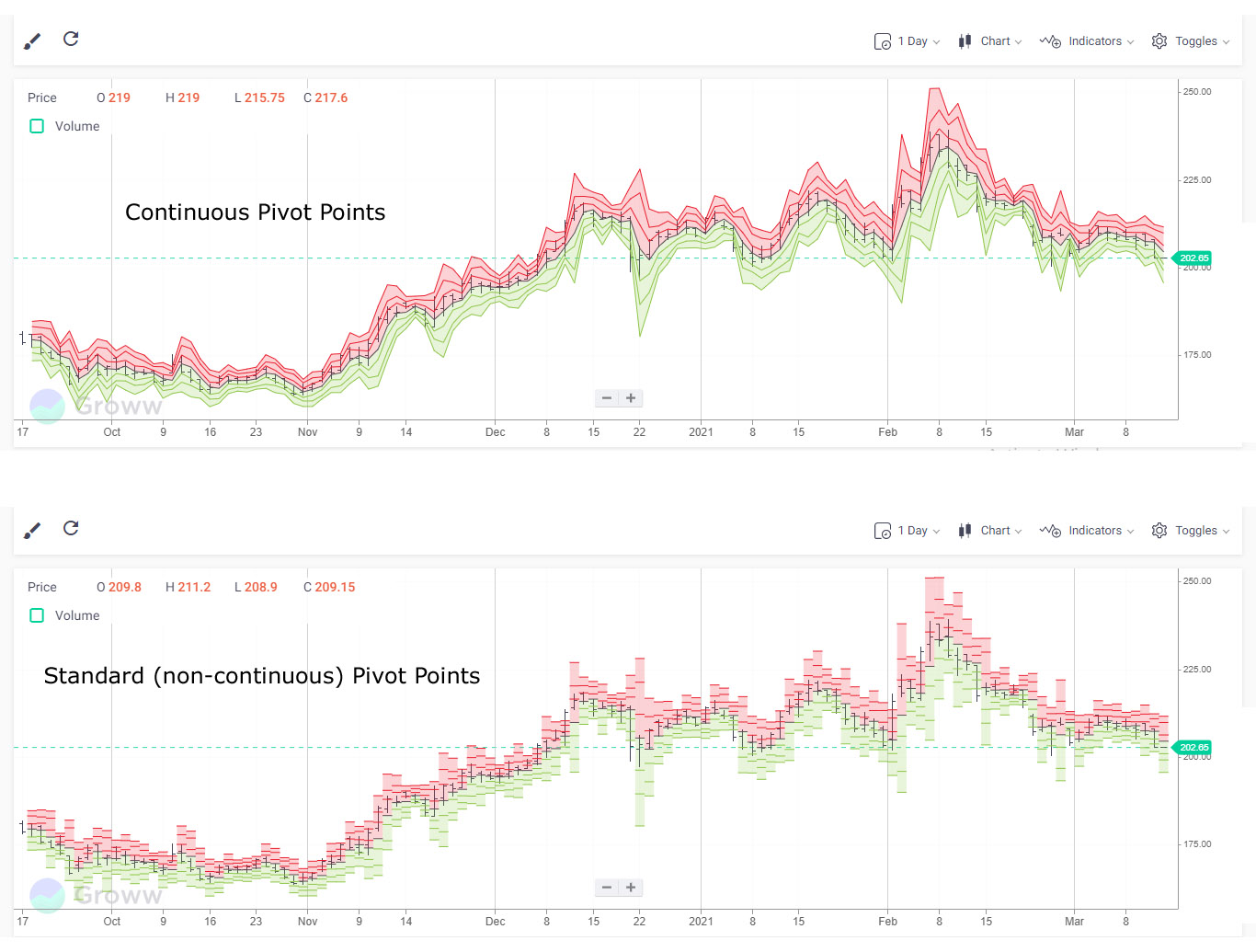
As you can see (more clearly in the Continuous Pivot Points chart), there are three levels of support and resistance displayed. These can help traders make buy/sell decisions by creating cut-off points.
On Groww, when you right-click on the Pivot Points, you get the following options for customization:
- Type – There are two types of Pivot points available – Standard and Fibonacci. Traders can use Fibonacci if they are conversant with Fibonacci ratios and want to use them to make trading decisions.
- Continuous – You can choose between having pivot points plotted individually (lower part of the above image), or as a continuous line (upper part of the above image) based on which helps you undertand trends better.
7. Volume Underlay
This is the same as the clickable volume option on the top left part of the chart.
8. Standard Deviation
Standard Deviation is a mathematical way of calculating the volatility of the stock market. It measures the dispersion of the stock price from its average price. In other words, it is a measure of how high or low a stock price can go based on historical data. This is how it looks:

Here is how you can use the Standard Deviation indicator to make trading decisions:
- A higher standard deviation means higher volatility in prices.
- If the price moves with a high standard deviation, then it is a sign of increased weakness or strength.
- If the price reaches an all-time high but is accompanied by increased volatility (or standard deviation), then it can be an indication of unsure traders in the market. On the other hand, if the peak happens with decreasing standard deviation, then it can be a sign of a maturing bull market.
- If the market hits its lowest and is accompanied by decreasing volatility, then it can be a sign of disinterested investors. On the other hand, if the bottom is accompanied by increasing standard deviation, then there could be panic-selling in the markets.
On Groww, when you right-click on the Standard Deviation line, you get the following options for customization:
- Period – This is the number of periods that you want to calculate the standard deviation for. If you are looking at a daily chart and a period of 30, then it means that the indicator will calculate the standard deviation for 30 days.
- Field – the price for which you want to calculate the moving average. This includes:
- Open
- High
- Low
- Close
- Adj_Close
- HL/2
- HLC/3
- HLCC/4
- OHLC/4
- Standard Deviations – Number of standard deviations
- Moving Average Type – the moving average type that you want to use to plot the line. There are various types of moving averages including:
- Simple
- Exponential
- Time Series
- Triangular
- Variable
- VIDYA
- Weighted
- Welles Wilder
- Hull
- Double Exponential
- Triple Exponential
Other Indicators
There are many other indicators that can help you analyze the stock performance better and spot profit-making opportunities with ease. Here is a quick look:
Anchored VWAP
A modified VWAP overlay where you can determine the starting point. This is what it looks like:

On Groww, when you right-click on the Anchored VWAP area, you get the following options for customization:
- Field – the price for which you want to calculate the moving average. This includes:
- Open
- High
- Low
- Close
- Adj_Close
- HL/2
- HLC/3
- HLCC/4
- OHLC/4
- Anchor Date
- Anchor Time
- Option to display 1, 2, or 3 standard deviations
Price Rate of Change
This is an unbounded momentum indicator that has a zero midpoint. This is how it looks:

On Groww, when you right-click on the Price Rate of Change line, you get the following options for customization:
- Period
- Field – the price for which you want to calculate the moving average. This includes:
- Open
- High
- Low
- Close
- Adj_Close
- HL/2
- HLC/3
- HLCC/4
- OHLC/4
Momentum Indicator
This indicator offers information about the rate at which the price of the stock changes. They only offer information about the speed of the change and NOT the direction. This is how it looks:
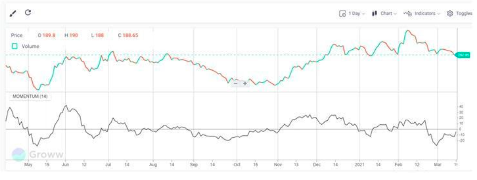
On Groww, when you right-click on the Momentum Indicator line, you get the following options for customization:
- Period
- Panel – within the plot area of the chart or as a separate panel
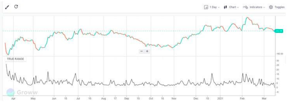
True Range
This indicator measures the daily price range plus/minus any gap from the closing price of the previous day. In other words, the closing price of the preceding period is substituted for the current low, if lower, of the current high, if higher. This is what it looks like:
On Groww, when you right-click on the True Range line, you get the following options for customization:
- Panel – within the plot area of the chart or as a separate panel
Key Takeaways
A stock market is an exciting place where fortunes are made and lost almost daily. It is also a complex place as there is no one simple way of reading charts in the stock market.
However, with the right tools, charts can be easy to read, informative, and may even help predict future stock prices.
|
You may also want to know |
|
|
1. |
How to Invest in Share Market |
|
2. |
How to Buy Stocks Online |
|
3. |
How Much Money Can You Make in Trading Stocks |
|
4. |
How Does the Stock Market Work |
|
5. |
How to do Valuation Analysis of a Company |
Check More Stocks
|
Shares Name |
Annual Revenue (in Cr) |
||||
|
2019 |
2020 |
2021 |
2022 |
2023 |
|
|
687 |
630 |
655 |
864 |
954 |
|
|
-- |
-- |
6479 |
6835 |
7307 |
|
|
14402 |
13325 |
15485 |
16030 |
15294 |
|
|
-- |
32.49 |
48.42 |
52.29 |
66.03 |
|
|
4225 |
4214 |
5645 |
7373 |
4717 |
|
|
244 |
225 |
232 |
223 |
272 |
|
|
43.57 |
48.32 |
46.48 |
50.08 |
53.05 |
|
|
127 |
144 |
102 |
139 |
148 |
|
|
11563 |
10345 |
11268 |
13439 |
11329 |
|